
Marshall McLuhan is often quoted for his aphorism: “The medium is the message.” Ironically, his point is often overlooked in publishing where shoddy book covers, gimmicky titles, and predictable layouts abound. Unfortunately, a lot of publishers place little value on cover design, book layout, and electronic book presentation. Within the digital age, a book has an electronic extension that surfaces ubiquitously, making impressions across the Net, and all kinds of digital platforms. You might say the cover, and overall creative input, is amplified through the inter webs.
While the Christian publishing world often trails behind leading secular publishers, I am grateful to have a publisher who recognizes the value of not only writing but also designing a good book. HarperCollins/Zondervan has bent over backwards to work with me in making sure the medium of my two most recent books also convey my message. How have they done this?
Book Covers
We all know people do judge a book by its cover. Fortunately, I have had a significant, shaping voice in everything materially created from cover to text to layout, poor souls! I asked up front for significant input on book cover and design. Here’s how it made a difference with Raised? Finding Jesus by Doubting the Resurrection. We went through the typical process of the publisher generating cover options based on input, but they also agreed to take design options from a local design firm in Austin.
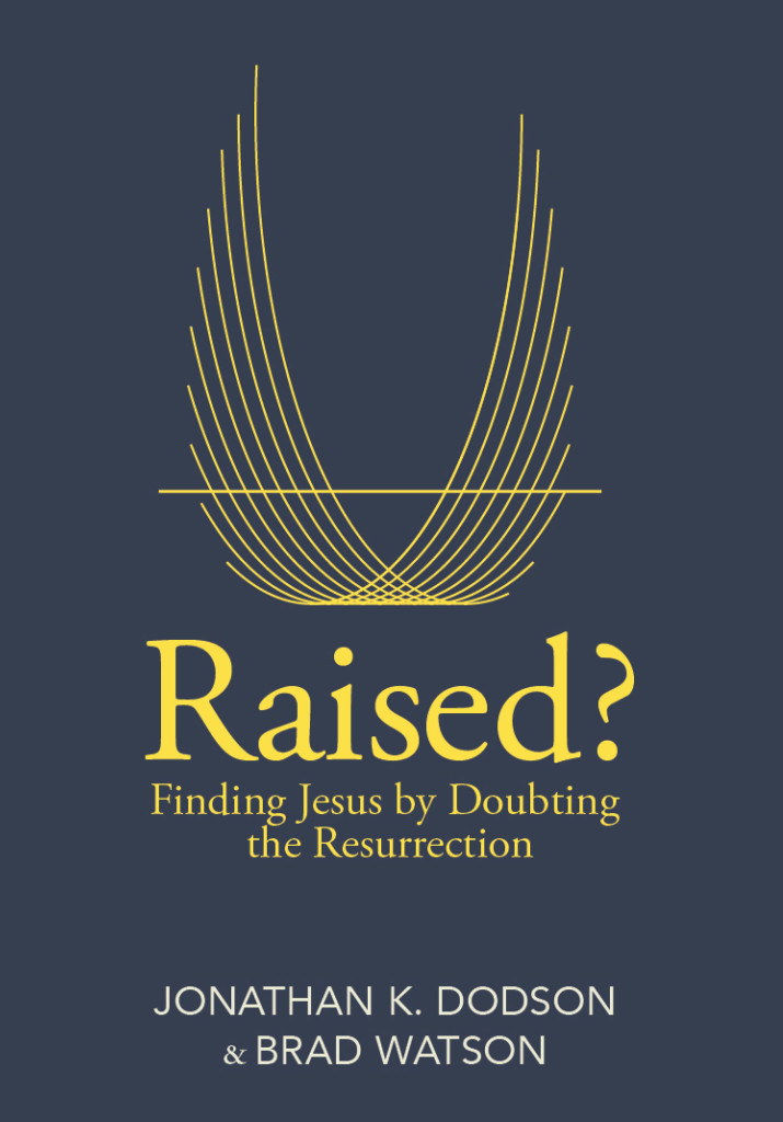
I wanted something clean, creative, and theologically significant. It all came together beautifully. Here’s the thinking behind the design:
- The wings are a subtle representation of the Spirit
- The horizontal line represents the earth, and behest the grave
- The meshed overlap represents Jesus’ victory over sin, death, and evil
- The overal motion represents Jesus descent, incarnation, suffering, death, and resurrection
Ptarmak is a leading brand, packaging, designer in Austin. Ben Hansen, a friend, mobilizes an incredible team there. Luke was my designer. I sat down with him and got to share the vision, my creative and theological values, and then they set him loose! He’s a great guy. I got to build a bit of relationship going local,  bumping into the Ptarmak guys around town, and dropping in to bring them Amy’s ice-cream, to celebrate publication, and distribute copies to the team.
Book Layout
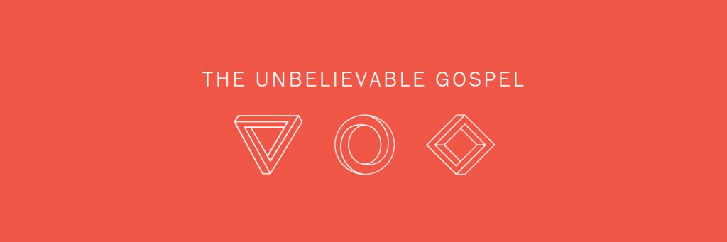
On The Unbelievable Gospel, I went to Electrik. They don’t typically do this sort of thing, but hey, they believed in the project. Brendan Pittman read the book, caught the vision, and created the icons you see up top. They represent the three sections of the book. You can read more about that at www.unbelievablegospel.com I’m thrilled to say that he’s working on a digital experience to pair with the book and it launches September 1.
Zondervan took Brendan’s work and willingly incorporated it into the book layout. We went a couple rounds before settling on the final form. I’m happy they let me push the envelope. You’ll see some atypical things going on inside the book when it arrives. As a benefit, I’ve developed a relationship with Brendan and see him as a real partner in this effort.
You’ll be the judge of this creative effort, but it’s my sincere desire to collaborate with others to publish great content and great delivery. Perhaps this will catch on. I know there are lots of folks doing similar things. I drew inspiration from Moody Publishers & Mark Sayers book Facing Leviathan. Let’s overturn the banal design beast, and generate more content with thoughtful, creative medium to boot!